Case Studies

UX Research & Structural Redesign for a Large-Scale Financial Platform
Client: Aditya Birla CapitalDomain: Financial Services | Consumer Finance | Enterprise UX
Context & Business Problem
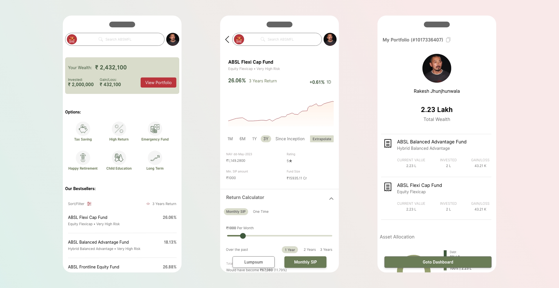
Aditya Birla Capital operates a large-scale consumer-facing financial platform serving lakhs of users across India. The business identified the need to redesign their digital experience to improve clarity, usability, and engagement across key financial workflows.
The existing experience suffered from navigation complexity, unclear information hierarchy, and fragmented user journeys, making it difficult for users to understand products, track investments, and complete key tasks confidently.
The objective was to reimagine the experience through research-led UX improvements that would simplify decision-making while meeting the expectations of a high-volume financial user base.
My Role & Responsibility
I led the UX research, evaluation, and structural redesign strategy for this initiative.
My responsibility included:
• Conducting UX audits and heuristic evaluations
• Framing user and business problems from a system perspective
• Defining information architecture and navigation improvements
• Translating research insights into actionable design recommendations
• Presenting findings and solutions to stakeholders for decision-making
This engagement focused on strategic UX direction, not surface-level visual changes.
Problem Framing & Research Approach
I began by analyzing the existing platform through:
• Heuristic evaluation of key user flows
• Review of navigation patterns and content structure
• Identification of friction points across onboarding, discovery, and task completion
The goal was to understand where and why users struggled, particularly in a domain where clarity and trust are critical.
Key Insights
Research and evaluation surfaced several systemic issues:
• Users found it difficult to locate and compare financial products
• Information hierarchy did not reflect user priorities or mental models
• Navigation paths were inconsistent across sections
• Key actions required unnecessary steps, increasing cognitive load
• The experience did not adequately support informed financial decision-making
These were structural UX issues, not cosmetic problems.
Design Strategy & Recommendations
Based on research insights, I proposed a structural UX redesign focused on:
• Simplifying information architecture to reflect user intent
• Reorganizing navigation around primary user goals
• Reducing cognitive load in critical financial flows
• Improving clarity of product information and status indicators
• Creating a more predictable and consistent interaction model
The recommendations were designed to scale across the platform and support future product growth.
System & Workflow Design
The redesign approach emphasized:
• Clear hierarchy of financial information
• Consistent navigation patterns across sections
• Task-focused user journeys for common financial actions
• Reduced steps for high-frequency tasks
The intent was to make the platform easier to understand, easier to navigate, and easier to trust.
Constraints & Trade-offs
While the UX redesign and recommendations were well received, implementation was deprioritized due to budget decisions made at the organizational leadership level.
My responsibility was to lead the UX research, evaluation, and design strategy for the initiative. Funding, delivery planning, and execution decisions were owned by senior leadership and delivery stakeholders outside the UX function.
This engagement focused on establishing a research-backed UX direction and structural blueprint, ensuring the organization had clear guidance to act on when conditions allowed.
Outcome & Impact
Although the redesign was not implemented, the engagement delivered:
• A clear UX audit identifying critical usability gaps
• Actionable, research-backed design recommendations
• A structural blueprint for future experience improvements
• Stakeholder alignment on the importance of UX clarity in financial products
The work helped establish a shared understanding of where UX improvements would deliver the highest value within the platform and provided the organization with a clear, research-backed roadmap for improving user experience when conditions allowed.
Why This Work Matters
This project demonstrates my ability to:
• Evaluate and redesign complex financial experiences
• Apply research and heuristic analysis in regulated domains
• Identify structural UX problems beyond visual design
• Communicate UX insights clearly to business stakeholders
• Deliver value even when implementation constraints exist
In large organizations, not all good design gets built immediately. Strong UX leadership ensures that when opportunities arise, teams are equipped with the right insights and direction.